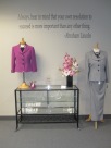
You'll never get a 2nd chance to make a great first impression!

Archive for the ‘Clothing’ Category

Pantone Reveals Color of the Year for 2014

Pantone Reveals Color of the Year for 2014:
PANTONE 18-3224 Radiant Orchid

Expressive, exotic Radiant Orchid blooms with confidence and warmth

CARLSTADT, N.J., Dec. 5, 2013 – Pantone, an X-Rite company and the global authority, today announced PANTONE® 18-3224 Radiant Orchid, a captivating, magical, enigmatic purple, as the color of the year for 2014.

“While the 2013 color of the year, PANTONE 17-5641 Emerald, served as a symbol of growth, renewal and prosperity, Radiant Orchid reaches across the color wheel to intrigue the eye and spark the imagination,” said Leatrice Eiseman, executive director of the Pantone Color Institute®. “An invitation to innovation, Radiant Orchid encourages expanded creativity and originality, which is increasingly valued in today’s society.”

“An enchanting harmony of fuchsia, purple and pink undertones, Radiant Orchid inspires confidence and emanates great joy, love and health. It is a captivating purple, one that draws you in with its beguiling charm.”

Radiant Orchid for Fashion
Radiant Orchid’s rosy undertones radiate on the skin, producing a healthy glow when worn by both men and women. A dazzling attention-getter, Radiant Orchid permeated the runways during the spring 2014 fashion shows and is already making its way onto the red carpet. Fashion designers featured in the PANTONE Fashion Color Report Spring 2014, including Emerson by Jackie Fraser-Swan, Juicy Couture and Yoana Baraschi, are incorporating Radiant Orchid into their spring collections and variations of this hue will carry into men’s and women’s clothing and accessories throughout next year.

Radiant Orchid for Beauty
A modern and surprisingly versatile shade, Radiant Orchid enlivens the skin, making all who wear it feel more healthy and energetic. Blending both cool and warm undertones, purple is an appealing hue for distinctive combinations and flattering to many hair, eye and skin tones.

This multifaceted hue is seductive when combined with red and pairs well with its sister shades of lavender, purple and pink, which provides an assortment of lipstick and blush options. Radiant Orchid’s exuberance also acts as a brilliant finishing touch to nails.

Radiant Orchid for Interiors
Spruce up interior spaces by incorporating this eye-catching hue in paint, accent pieces and accessories. As adaptable as it is beautiful, Radiant Orchid complements olive and deeper hunter greens, and offers a gorgeous combination when paired with turquoise, teal and even light yellows.

Likewise, the vibrant color is sure to liven up neutrals including gray, beige and taupe. Uplifting and bold without being overpowering, Radiant Orchid reenergizes almost any color palette and provides a unifying element for diverse spaces.

Cross-Referencing to Other PANTONE Libraries
PANTONE 18-3224 Radiant Orchid can also be cross-referenced to all other PANTONE Libraries including PANTONE PLUS for graphic design. For cross-referencing information, see http://www.pantone.com/ColoroftheYear.

About the PANTONE Color of the Year
The color of the year selection requires careful consideration and, to arrive at the selection, Pantone quite literally combs the world looking for color influences. This can include the entertainment industry and films that are in production, traveling art collections, hot new artists, popular travel destinations and other socio-economic conditions. Influences may also stem from technology, availability of new textures and effects that impact color, and even upcoming sports events that capture worldwide attention.

For more than a decade, Pantone’s Color of the Year has influenced product development and purchasing decisions in multiple industries, including fashion, home and industrial design, as well as product packaging and graphic design. Past colors include:

  • PANTONE 17-5641 Emerald (2013)
  • PANTONE 17-1463 Tangerine Tango (2012)
  • PANTONE 18-2120 Honeysuckle (2011)
  • PANTONE 15-5519 Turquoise (2010)
  • PANTONE 14-0848 Mimosa (2009)
  • PANTONE 18-3943 Blue Iris (2008)
  • PANTONE 19-1557 Chili Pepper (2007)
  • PANTONE 13-1106 Sand Dollar (2006)
  • PANTONE 15-5217 Blue Turquoise (2005)
  • PANTONE 17-1456 Tigerlily (2004)
  • PANTONE 14-4811 Aqua Sky (2003)
  • PANTONE 19-1664 True Red (2002)
  • PANTONE 17-2031 Fuchsia Rose (2001)
  • PANTONE 15-4020 Cerulean (2000)

About Pantone and the Pantone Color Institute
Pantone LLC, a wholly owned subsidiary of X-Rite, Incorporated, is the global color authority and provider of professional color standards for the design industries. Pantone products have encouraged colorful exploration and expressions of creativity from inspiration to implementation for more than 50 years. Through the Pantone Color Institute, Pantone continues to chart future color direction and study how color influences human thought processes, emotions and physical reactions. Pantone furthers its commitment to providing professionals with a greater understanding of color and to help them utilize color more effectively. Always a source for color inspiration, Pantone also offers designer-inspired products and services for consumers. More information is available at www.pantone.com. For the latest news, trends, information and conversations, connect with Pantone on Facebook, Twitter, Pinterest and Instagram and the Pantone Blog.

About X-Rite
X-Rite, Incorporated, is the global leader in color science and technology. The company, which now includes color industry leader Pantone, develops, manufactures, markets and supports innovative color solutions through measurement systems, software, color standards and services. X-Rite’s expertise in inspiring, selecting, measuring, formulating, communicating and matching color helps users get color right the first time and every time, which translates to better quality and reduced costs. X-Rite serves a range of industries, including printing, packaging, photography, graphic design, video, automotive, paints, plastics, textiles, dental and medical. For further information, please visit www.xrite.com.

PANTONE®…The color of ideas℠.

– # # # –

PANTONE® and other Pantone trademarks are the property of Pantone LLC. © 2013. All rights reserved. Lowe’s is a registered trademark of LF, LLC. All rights reserved. All other trademarks are the property of their respective owners.
First Dates-Dress to Impress!

index

Tis the season of holiday cheer, parties and special occasions. Which clothing colors, accessories and jewelry will make you look and feel your best for that important first date or special occasion? Gain confidence by wearing the best colors for you. If you’re wearing the right ones, you’ll be confident that you look your best because they harmonize with and bring out the beauty in your unique coloring; your skin complexion, eyes and hair color.

Wearing “your” colors  will make you look healthier, happier, younger, more vibrant and help you project a really positive image. Colors that complement your skin, hair and eyes make you look more attractive.

Whether you are a man or a woman, what you wear does matter because you only get one chance to make a good first impression.

Here are a few Do’s and Don’ts for that special date:

http://www.coloursfornaturalliving.com/Dating.html

Look Great While You Are Losing Weight!

positiveweightloss
At Colours for Natural Living I work with clients to create custom color wardrobe palettes for business and casual wear. The way we dress is closely tied to how we feel inside, particularly when our bodies are changing as a result of weight loss or increased fitness levels. When people are losing weight, there’s often a fear that they’re going to return to the size they were so they hold on to their old clothes. This is the perfect time to start cleaning out your closet and getting rid of what no longer fits. It will help you see that you’re moving forward towards your goals and make room for new purchases.

If you are still working towards your goal weight, dress the body you have now. Buy fill in pieces that fit well and make you feel comfortable, strong and confident. Shopping for an in-progress body can be challenging, but need not be expensive. Visit local consignment stores or shop outlet malls to find in-between items and consign some of the higher-quality clothes you’ve just cleared from your closet. Buy pieces that project your new image and speak to your emerging sense of style and confidence, rather than settling for purely functional items.

When you have reached your goal and are ready to create your new image and wardrobe forget about the numbers. Each store has a different size chart, a size 0 at one store could be a size 14 or 16 at another. What is most important is how it fits you and if it is the color and best style for your body shape. A proper fit will always give you the best results, invest in good quality basics.

I believe in enhancing your natural beauty and features through wearing the colors that best compliment your skin tone. It makes you look vibrant and healthy and everything will harmonize. It is easy to create a wardrobe capsule of 5-12 pieces in your best colors. Purchase pants, a skirt, jackets and blouses in solid colors that you can mix and match. If you love prints add in those items that will work with all of the solid colors. Accessorize with scarves and jewelry, or ties for men.

Both Dress for Success San Diego and Second Chance San Diego would welcome donations of gently used men and women’s clothing. Please contact me for more information on donating or consigning, 619-254-6807.

Brenda J. Harrison, Image & Wardrobe Consultant
http://www.ColoursforNaturalLiving.com

Purse Suits for Success-Transforming lives!

419262_10150724296810996_1400450496_n

Many thanks to all of you who generously donated clothing and accessories for the recent donation apparel drive to benefit Dress for Success San Diego. Also thanks and appreciation  to those of you donated your time and helped make the event fun filled and rewarding.  The event was held August 31st at the beautiful Marina Village Conference Center in Mission Bay. We had 24 vendors, there was networking, shopping, opportunity drawings and people stopping by to donate clothing and enjoy a cup of delicious Point Loma Tea.  I am very proud to say the goal of 100 suits was realized and in fact exceeded! These are the items that were donated as a result of the event:

104 professional suits
307 pieces of workplace attire
23 pairs of shoes
16 fabulous handbags

Many of you asked, “When is the next one?” Next spring! However, for those of you who were unable to attend our fall event and wish to donate, I am still accepting donations on behalf of Dress for Success San Diego. Give me a call at Colours for Natural Living and we will arrange a day and time, 619-254-6807.
Great job everyone!


Fall Fashion Trends in Color

pantone fall colors

Fall 2O13: A Palette of Many Moods
This season, designers express the many moods of fall with skillfully arranged collections that will enhance and enliven customers’ outlooks as the colder months set in. Similarly, colors come together to create moods that range from sophisticated and structured to lively and vivid, encapsulating our inherent need for wardrobe variety to reflect emotions that run from thoughtfully introspective to irrepressibly elated.
With the changing season, the greens from spring evolve and develop. Multifaceted Emerald continues to sparkle and fascinate, bringing luxury and elegance to the palette, while yellow-toned Linden Green brings a lightness and brightness to the deeper shades of fall. Try pairing both with Mykonos Blue, a bold, meditative blue, for a classic and relaxed fall look. Exotic Acai adds mystery and richness to the palette, and can be incorporated with the other colors to create a number of powerful fall combinations. Pair the elegant shade of purple with Emerald for a regal disposition, or spirited Samba red for an expressive and dramatic look. Koi, a decorative orange with dazzling and shimmering qualities, is a statement color that serves as a pick-me-up for your wardrobe. Vivacious, an unruly and wildly deep fuchsia, adds an ebullient sensuality to the palette. Pair Vivacious with anchoring Deep Lichen Green, a naturally lush shade of green, for a dynamic juxtaposition that captures both ends of the seasonal spectrum. Rounding out this season’s cornerstone colors, Turbulence, a dark mercurial gray, and Carafe, a rich, glamorous brown, provide more interesting and sophisticated alternatives to the black basics usually worn in colder months. Both staple neutrals pair gracefully with more expressive colors within the palette, such as Samba, Koi and Vivacious.

For more than 20 years, Pantone, the global authority on color, has surveyed the designers of New York Fashion Week and beyond to bring you the season’s most important color trends. This report previews the most prominent hues for fall 2013.

Hello Autumn!

helloautumn-banner1

Autumn’s color palette is warm, deep and muted like fall foliage.
Knowing which season  you fall into will help you make wise shopping choices for clothing, jewelry, accessories and makeup. A personal color consultation will quickly tell you if you are cool or warm and which of the seasons you fall into.
Autumn’s image is one of  richness, spice and earthiness. Gold undertones are the best colors for Autumn women to wear. Shopping with a swatch wallet can save you time and money as you focus only on the colors that will best compliment your skin tone. Autumn’s best makeup choices are warm colors in shades of honey to copper to dark brown.
To schedule a Personal Color Consultation with a FREE Wardrobe Audit call,
619-254-6807
Colours for Natural Living is a proud sponsor of
423926_10150724304350996_452643207_n


Hate shopping? I can help.

Grey Suit

People judge an individual based on how they look within 35 seconds of meeting them. How can you afford not to look your best? In today’s workplace, whether professional suits or business casual are the norm, men can no longer get away with wearing the same old outfits to work. Brenda is an expert at determining the colors that will make you look healthy, vibrant and professional.

For those of you who hate to shop, Brenda can assist you with personal shopping or refer you to a trusted colleague for custom shirts and suits. The photo above was a shirt, suit and tie that Brenda selected for a client who hates to shop and was applying for a promotion. He looked polished, professional and got the job!

For more information on a color consultation, wardrobe coordination or personal shopping call 619-254-6807

Hello Summer!

Image

Summer’s color palette is harmonious, elegant and soft. Summer women fall into these categories; Light, Muted or Cool. Knowing which of these you fall into will help you make wise shopping choices for clothing, jewelry, accessories and makeup. A personal color consultation will quickly tell you if you are cool or warm and which of the seasons you fall into.
Summer’s image is one of refinement and gentleness. Blue undertones are the best colors for Summer women to wear. Shopping with a swatch wallet can save you time and money as you focus only on the colors that will best compliment your skin tone. Summer’s best makeup choices are light and cool colors, avoid warm brown or black mascara as it is too severe. For an in-depth personal color analysis call, 619-254-6807
Gift certificates and Home Swap Parties are available.
http://www.ColoursforNaturalLiving.com

Purse-Suits for Success

423926_10150724304350996_452643207_n                                                               DRS Boutique

Colours for Natural Living is proud to sponsor an apparel donation drive to benefit the San Diego Chapter of Dress for Success. The mission of Dress for Success San Diego is to promote the economic independence of disadvantaged women by providing professional attire, a network of support and career development tools to help women thrive in work and in life.

Founded in New York City in 1997, Dress for Success is an international not-for-profit organization organizing services designed to help clients find jobs and remain employed. Each Dress for Success client receives one suit when she has a job interview and can return for a second suit or separates when she finds work.

Donations of the following are appreciated: 

Current style, clean, ready-to-wear, interview appropriate women’s attire:  skirt suits, pant suits, neutral blouses, gently used purses and shoes (closed toe only, no sandals) on hangers in dry cleaner bags or folded neatly in boxes. Tax receipts will be provided.

Come join us on August 31, 2013, 10:00 am- 2:00 pm  at the Coral Room, Marina Village 1936 Quivira Way, San Diego, CA 92109.  There will be door Prizes & Refreshments! Enjoy a cup of tea after dropping off your donation at this beautiful waterfront location.   

For more information contact:

Brenda J. Harrison, 619-254-6807  www.ColoursforNaturalLiving.com

Thank you for your support!

Dress for Success San Diego

619.533.6014

www.dressforsuccess.org/sandiego